
Best Lighting Techniques for Luxury Nature Wall Displays
Table of Contents
- Why Lighting Makes or Breaks a Nature Wall Display
- Best Lighting for Wall Art: Matching the Source to the Specimen
- How to Light a Shadowbox Without Glare or Washed-Out Colour
- Gallery Wall Lighting: Coordinating Multiple Frames and Domes
- Artwork Spotlight Placement: Distance, Angle and Beam Width
- Building Depth and Atmosphere with Layered Lighting
- Indoor Versus Outdoor Nature Wall Displays: Different Rules
- Conclusion
- Frequently Asked Questions
Last Updated: October 19, 2026
Why Lighting Makes or Breaks a Nature Wall Display
A preserved butterfly under bad light is just a brown shape behind glass. Under the right light, the same specimen throws back electric blue, turquoise, or a shifting green shimmer that changes as you walk past.
Most people flood the wall with a bright ceiling fixture and wonder why the colours look flat. Here is what actually happens when light meets a specimen.
How Light Interacts with Iridescent Wings and Preserved Specimens
Iridescence is not pigment but structure.
A flat, straight-on beam kills the effect. Our Morpho didius Butterfly in a Frame shows its full metallic blue depth only when the beam hits it at an angle.

Preserved specimens also carry fine texture: wing veins, antennae, the ridged shell of a beetle. Raking light from the side picks out that texture. Flat light erases it.
Best Lighting for Wall Art: Matching the Source to the Specimen
The best lighting for wall art is a dimmable LED spotlight rated at 3000K to 3500K with a colour rendering index of 90 or above, aimed at 30 to 45 degrees. That combination shows true colour, keeps heat off the specimen, and lets you tune brightness. What separates a competent install from a luxury one is matching the fixture's beam, output and colour quality to the material in the frame.
Why those numbers matter:
- 3000K to 3500K reads as warm white and flatters natural tones. Below 3000K, browns and ochres go muddy; above 4000K, iridescent blues and greens look clinical.
- CRI of 90+ means colours render close to how they look in daylight. On an iridescent wing, low CRI dulls the shimmer. Look for fixtures that also publish an R9 value (deep red rendering) above 50; many natural browns, rusts and amber tones depend on it.
- Dimmable lets you drop output at night so the piece glows rather than glares. A fixture that dims smoothly to 10 per cent without colour shift beats one that only reaches 30 per cent.
Matching Beam Angle to the Display Type
Beam angle is the setting most people ignore and the one that most changes the result. A narrow beam (10-24 degrees) pulls out texture on a small specimen, a medium beam (25-40 degrees) suits most framed shadowboxes, and a wide beam (50 degrees and up) is for wall washing, not accenting.
A practical starting point: choose a beam angle roughly equal to the diagonal of the frame plus 10 degrees of spill. A 30 cm-wide shadowbox wants a 25-30 degree beam at 40 cm distance.
Colour Temperature and Material Appearance
Colour temperature changes how natural materials read, and not uniformly. Warm light (3000K) enriches wood, amber, shell and dried foliage; neutral light (3500K) keeps iridescent blues, greens and silvers cleaner.
CRI and colour temperature work together: a 3000K fixture at CRI 80 makes a preserved leaf look flat and grey, while CRI 95 restores the olive and gold undertones. For luxury displays, treat CRI 90 as the floor and CRI 95 as the target.
LED, Halogen or Picture Light: What Works and What to Avoid
Halogen is out. It runs hot, heat is the enemy of any preserved specimen, burns through energy, and fades colour. A 50W halogen placed close can dry and warp delicate wing scales.
LED is the clear winner for nature wall displays: it stays cool, uses a fraction of the power, and comes in dimmable warm-white options.
Picture lights, slim bars mounted above a frame, work for a single piece but throw uneven light on deep shadowboxes and suit flat art better than three-dimensional displays.
How to Light a Shadowbox Without Glare or Washed-Out Colour
To light a shadowbox without glare, place the light source outside the glass line and angle it down at roughly 30 degrees, so the beam hits the specimen but never bounces back at the viewer.
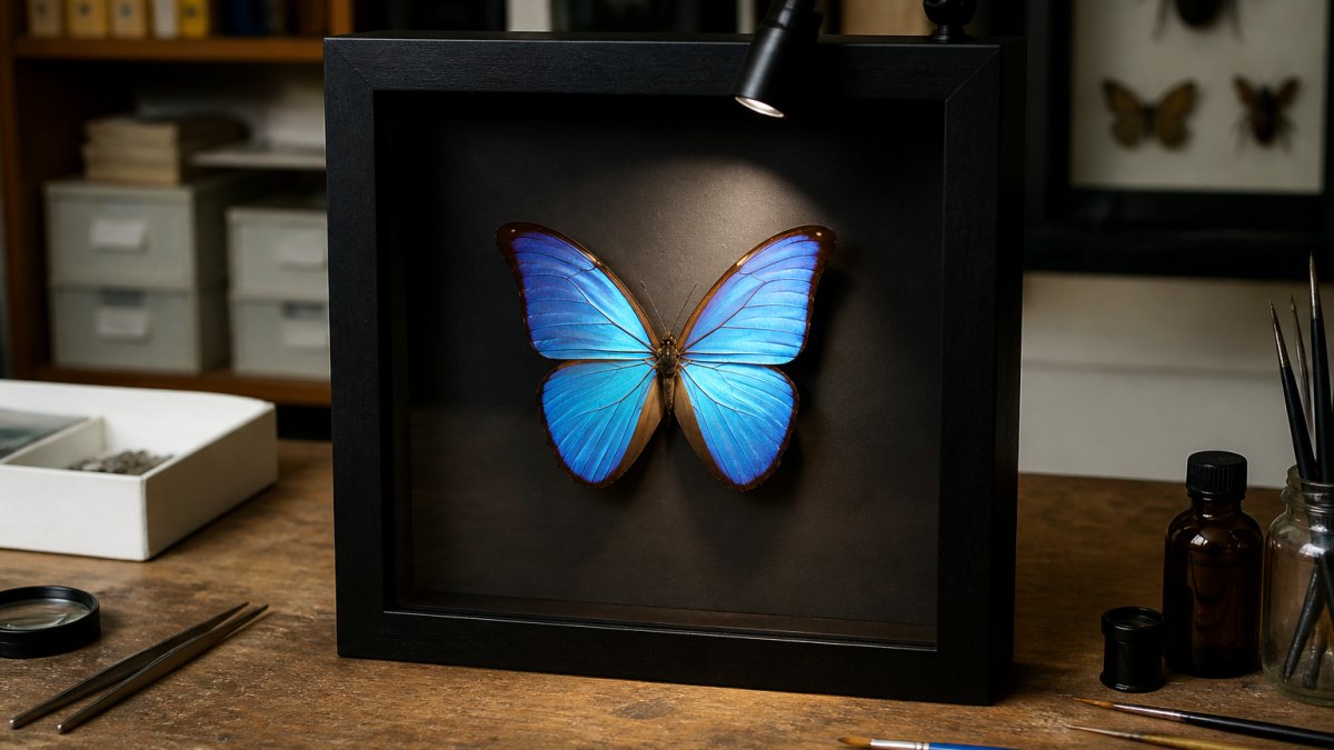
Glare is the most common mistake with framed displays. It comes from three things:
- Light hitting the glass straight on. Angle the beam so it strikes the specimen, not the glass face.
- A fixture mounted too close. Move it forward and up.
- Too much brightness. A dimmed beam reads richer than a bright one.
Washed-out colour happens when the beam is too wide or too strong, flattening texture. Narrow the beam and drop the intensity. Our Urania ripheus Moth in a Frame rewards this: the sunset tones deepen when the light is restrained.
Gallery Wall Lighting: Coordinating Multiple Frames and Domes
Gallery wall lighting works best when every frame shares one colour temperature and one beam character, even if the fixtures differ. Consistency matters more than matching fixtures.
A mixed display, say a Double Papilio ulysses Butterflies in a Frame beside a Triple Stag Beetles in a Frame, needs a plan:

- Group frames by size and keep the beam widths similar.
- Run all fixtures on one dimmer circuit so the whole wall rises and falls together.
- Leave breathing room between pieces so each beam pools on its own frame.
- For glass domes, light from above and slightly behind to avoid a hotspot on the curve.
Artwork Spotlight Placement: Distance, Angle and Beam Width
Artwork spotlight placement comes down to three settings: distance, angle, and beam width.
Morpho didius Butterfly in a Frame →
A simple rule for beam width: the beam should cover the frame, not the wall around it. Too wide and you light the wallpaper.
Distance controls intensity: closer is brighter and hotter, further back softens the pool.
Angle controls texture. A steeper angle rakes across the surface and pulls out detail. A flatter angle fills evenly but loses depth.
| Setting | Starting Point | Adjust When |
|---|---|---|
| Distance from wall | 30-45 cm | Move forward if glass glares |
| Angle | 30 degrees down | Steepen for more texture |
| Beam width | Frame width plus a little | Narrow if light spills on wall |
| Colour temperature | 3000K-3500K | Keep consistent across the wall |
| Dimming | 50-70% output | Raise only if the piece looks dull |
Building Depth and Atmosphere with Layered Lighting
Layered lighting separates a museum-quality display from a hallway one: ambient light for the room, accent light for each specimen, and a little low-level light for mood. The accent layer does the real work.
The goal is contrast. A bright specimen against a softly lit wall gains depth. A specimen lit as brightly as everything around it disappears into the room.
Indoor Versus Outdoor Nature Wall Displays: Different Rules
Indoor and outdoor displays follow different rules because the threats differ. Indoors, the risks are heat, glare, and colour fade from strong light. Outdoors or in a covered alfresco area, add moisture, temperature swings, and direct sun, plus the technical detail of what rating a fixture needs and how UV and heat affect preserved material.
Indoor Displays: Control Heat, Glare and UV
For indoor pieces, cool LED and controlled angles solve most problems. The remaining threats are cumulative: heat from a fixture placed too close, glare from glass, and UV from windows. Keep fixtures at least 30 cm from the frame face and choose LED over any heat-producing source.
Viewing comfort matters indoors because the room is often dim around the display. A bright accent against a dark wall reads as drama, but if the beam spills onto the viewer's line of sight it becomes glare.
Outdoor and Semi-Outdoor Displays: Ratings and Exposure
For outdoor or semi-outdoor settings, you need fixtures rated for damp conditions, sealed frames, and shade from direct sun. In Australia, look for an IP rating of at least IP44 for covered alfresco areas and IP65 or higher where wind-driven rain or hose spray is possible.
A covered patio wall can work with weather-rated fixtures, a sheltered position, and no direct beam on the glass.
Preservation: UV, Heat and Light Sensitivity
Preserved natural materials vary in light sensitivity. Iridescent wing scales are relatively stable but can dull under sustained strong light; dried foliage, shell and some beetle elytra are more sensitive to UV and heat.
Heat is the quieter threat. A fixture that runs cool to the touch is safe at close range; one that runs warm should be moved further back or replaced. For delicate pieces, a remote driver and a low-output fixture give the most control.
Conclusion
Getting the light right is the difference between a specimen that sits on a wall and one that stops people mid-step. Angle the beam, warm the colour, dim it down, and let the structure of the wings do the rest.
If you are building a display, start with a piece worth lighting. Our Swallowtail Swirl and Turquoise Emperor in a frame both reward careful lighting with colour that shifts as you move.

Shop the collection at Newman Art Designs and give your wall the light it deserves.
Frequently Asked Questions
What is the best lighting for wall art like framed butterflies and moths?
The best lighting for wall art with preserved specimens is a dimmable LED fixture with a colour temperature between 2700K and 3000K and a CRI of 90 or higher. Warm light brings out the iridescent blues and greens in butterfly wings without washing them out. Avoid direct sunlight, which fades colours over time, and steer clear of halogen, which emits heat that can damage delicate specimens. A dedicated picture light or a low-voltage spotlight mounted above the frame gives you control over intensity and direction.
How do you light a shadowbox display without glare?
To light a shadowbox without glare, position the light source above and slightly in front of the frame, aiming down at roughly a 30-degree angle. Keep the light at least 30 to 45 centimetres away from the glass. Use a diffuser or a fixture with a honeycomb louvre to soften the beam, and choose a dimmable LED so you can lower the intensity. If reflections persist, tilt the light slightly further off-axis or move it closer to the wall so the beam grazes the glass rather than hitting it head-on.
Can direct sunlight damage preserved specimens and nature-inspired art?
Yes. Ultraviolet and visible light from direct sun will fade the colours of preserved butterflies, beetles and moths over months or years, and the heat can dry out and crack delicate wings and exoskeletons. Keep displays out of direct sun and use LED bulbs, which emit very little UV compared with older halogen or incandescent sources. If a frame sits near a window, fit a UV-filtering film to the glass or move the display to an interior wall that receives only indirect light.
How far should a picture light be from the artwork?
As a rule, mount a picture light 30 to 45 centimetres above the top edge of the frame. For a small shadowbox, 30 centimetres is usually enough; for a larger frame, go closer to 45 centimetres. The light should sit slightly forward of the frame so the beam washes down the face of the glass rather than reflecting back at the viewer. Adjust the angle until the specimen is evenly lit and the glass shows no hot spots.
